problem space
The ATM and CDM kiosk interface was built for basic cash withdrawals 25 years ago and had not evolved to support modern touch interactions or expanded services. As new features were added, the experience became harder to navigate, especially for non-frequent and older users.
This resulted in:
Confusing navigation beyond simple withdrawals.
Lack of clear guidance for multi-step transactions.
High cognitive load on a high-traffic, business-critical touchpoint rolled out at national scale.
The opportunity was to redesign the kiosk experience to be intuitive, accessible, and confidence-building, while preserving familiar mental models and supporting a growing range of services.
Evolved for a New Era


Measure Today to Master Tomorrow
evaluate
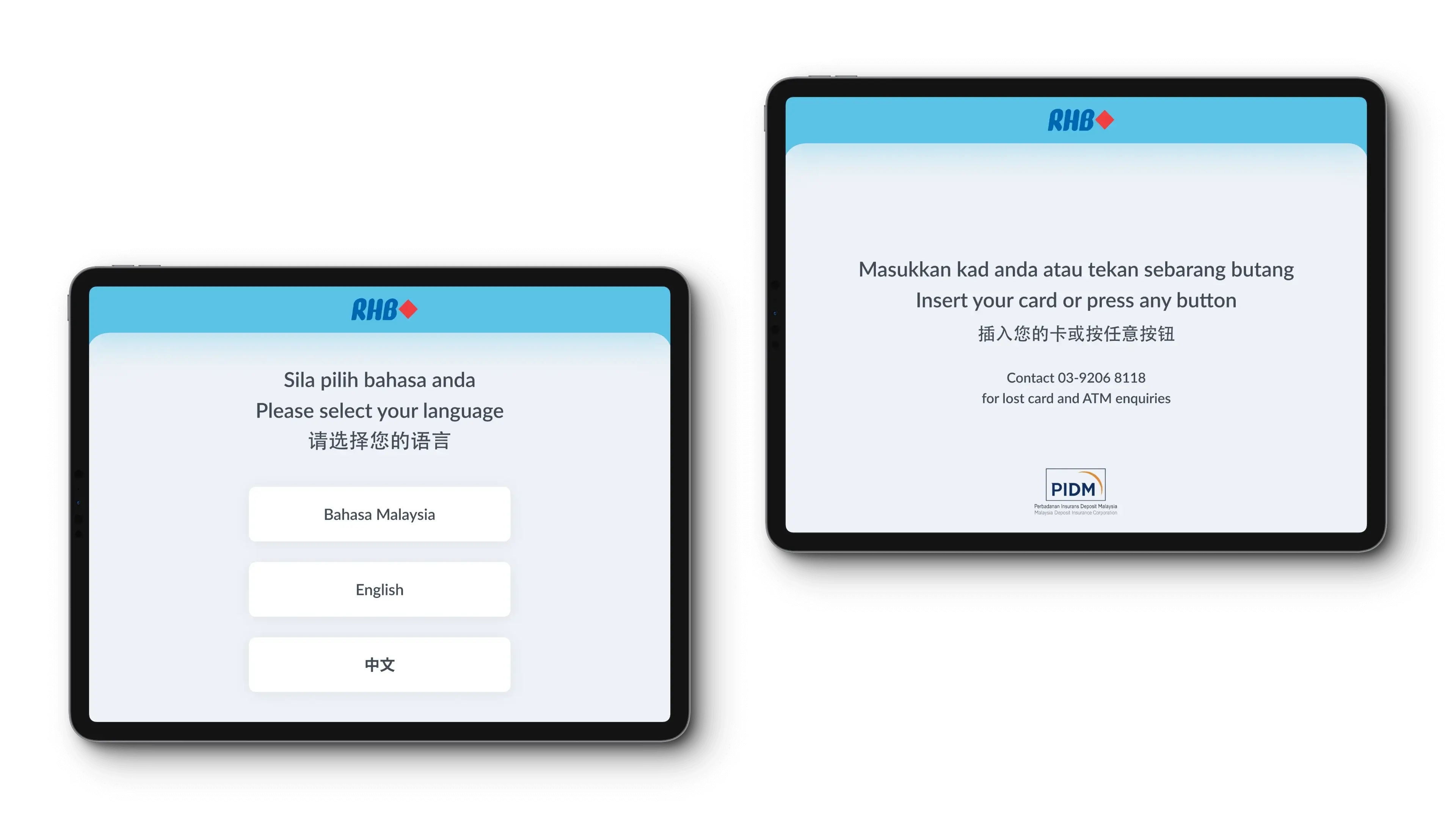
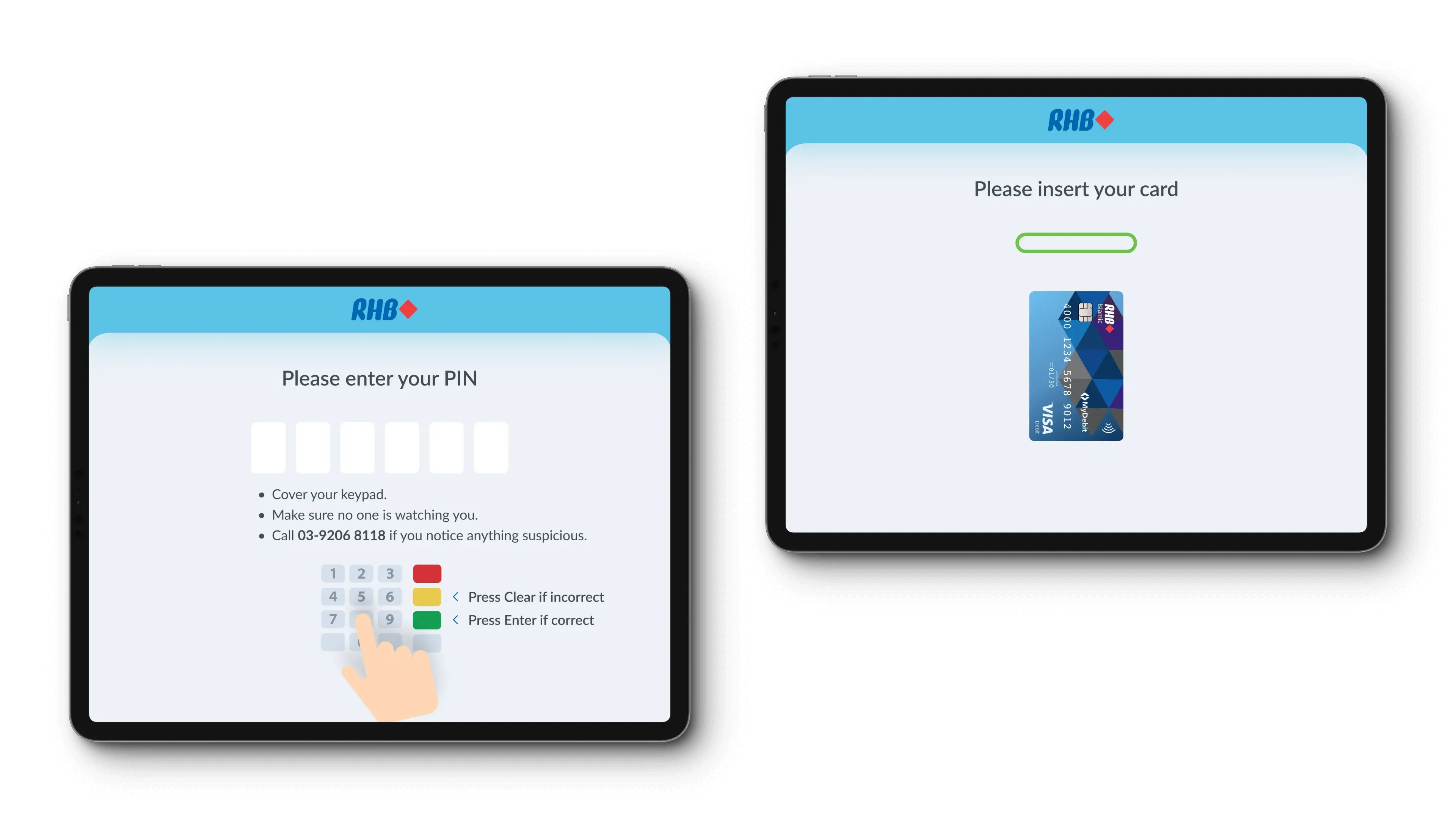
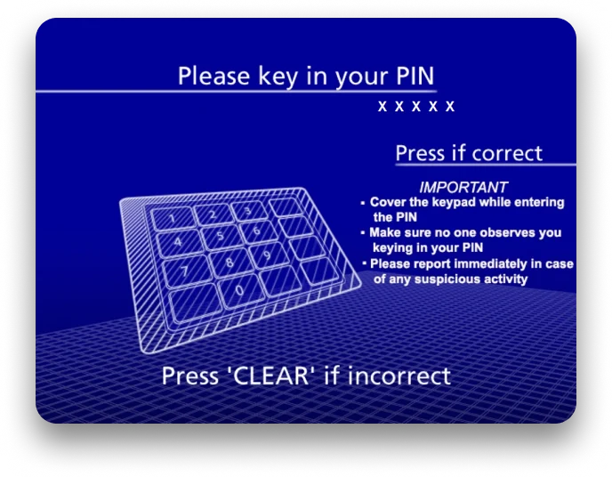
Understanding the Current Interface
This interface works on kiosks with 4 physical buttons on each sides, displaying up to 8 options.
More Details

Years of use has created familiarity and muscle memory, strong reasons to maintain the current workflow.
Outdated interface conflicts with our bank's modern image of being a progressive bank.
Type scale lacks standardisation. Using capital letters with excessive kerning on service menu hampers readability.
As per our recent re-branding, the diamond symbol can't be used alone. It must accompany RHB letters in the logo.
evaluate
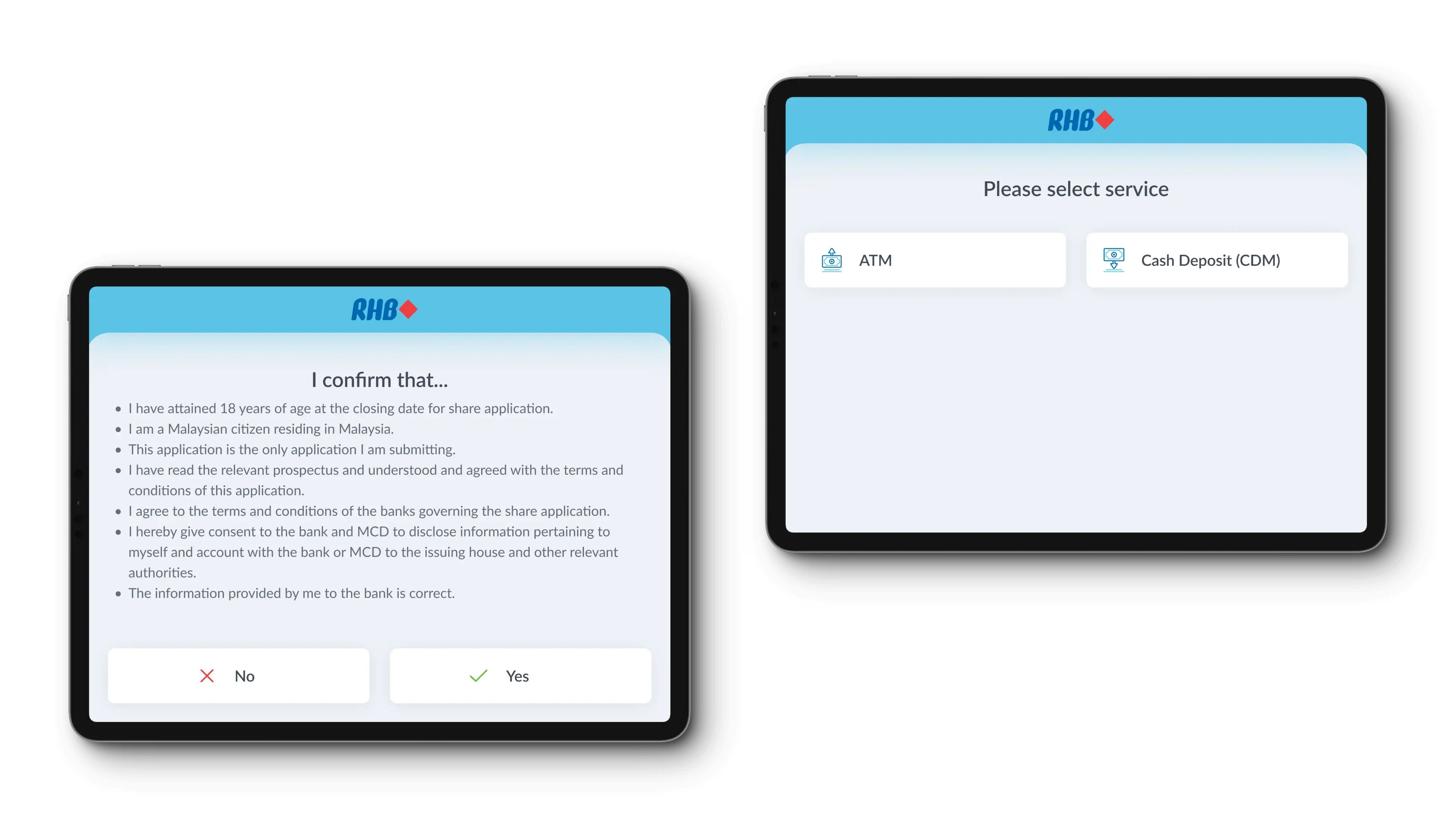
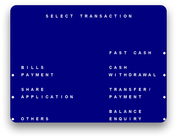
Analyzing the Current Flow
Past data shows users often check balances before withdrawing, but the one-way flow forces them to start from the beginning, a common complaint.

evaluate
Presenting Draft for feedback
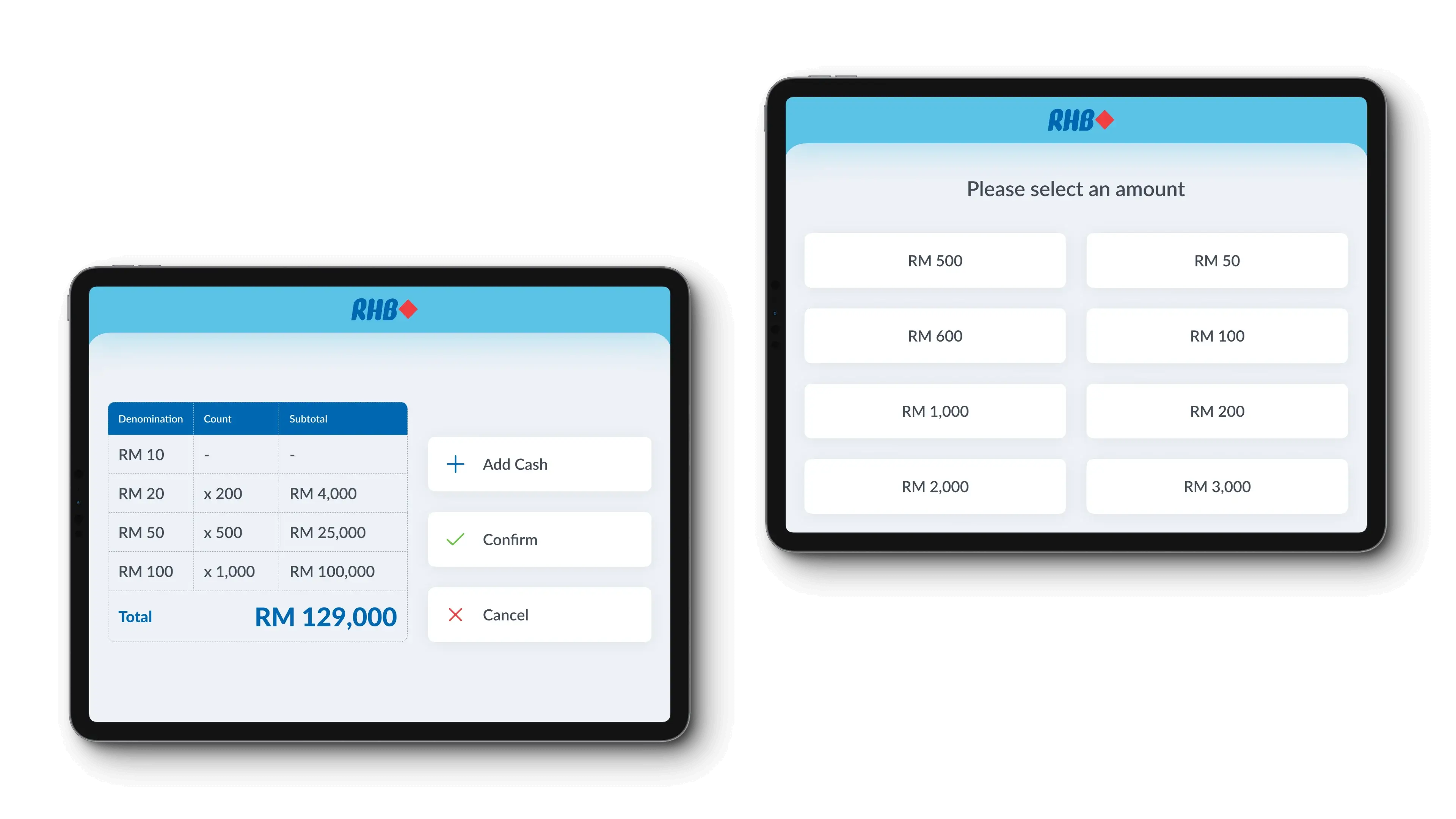
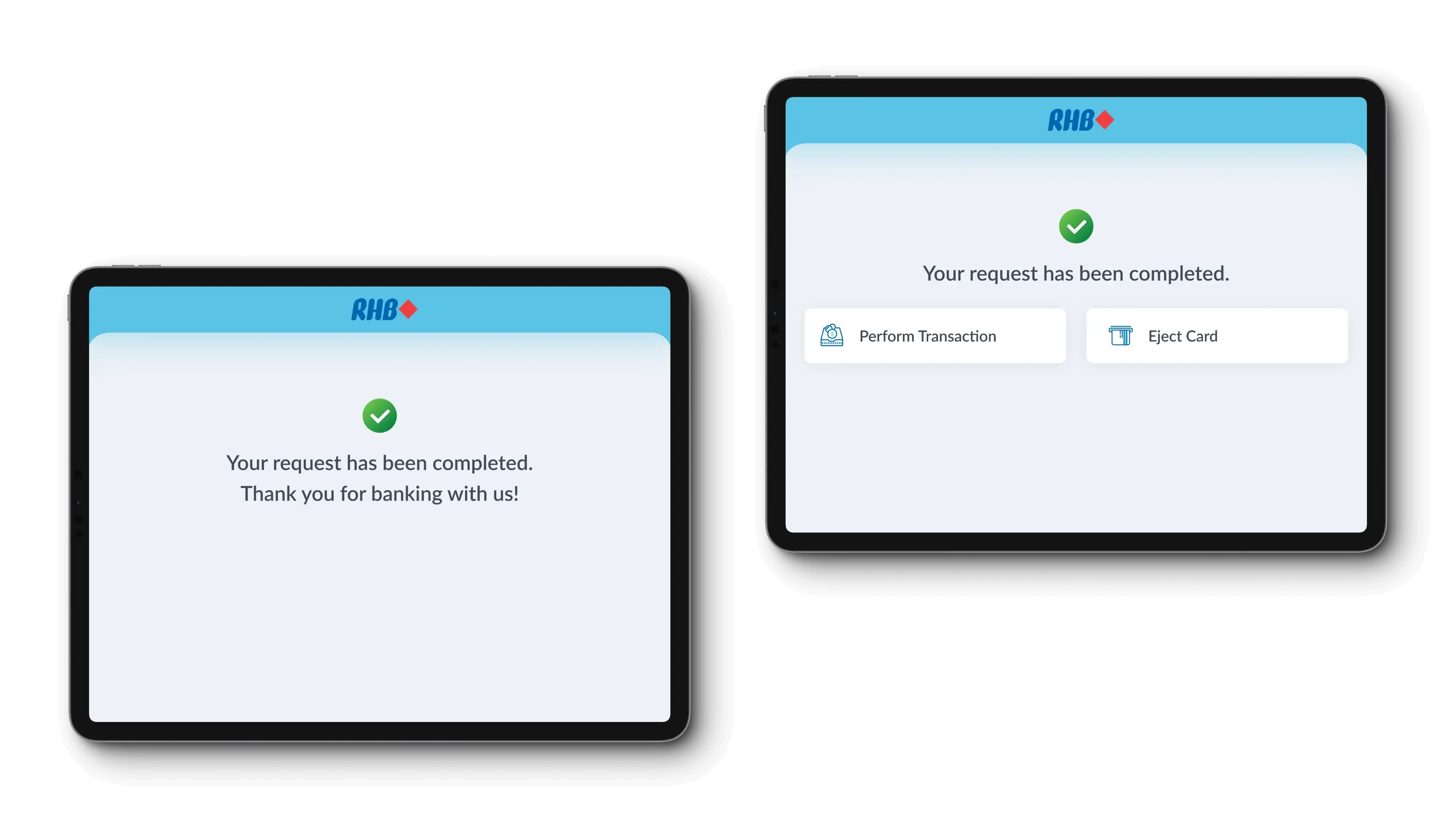
I added a button to allow users to perform another transaction without starting a new session.
Other Proposals
Controls exhibit modern design, and the touch interaction (pressed state) mimics the sensation of pressing a physical button.


Card animation guides correct insertion, while keyboard animation prompts physical keypad use.
Screen transitions indicate progress in the user's journey, moving seamlessly from one stage to the next.
Utilizing the RHB brand color for the background enhances brand recognition.

Listing services vertically may pose a learning curve for older users accustomed to the decades-long Z-shaped layout.
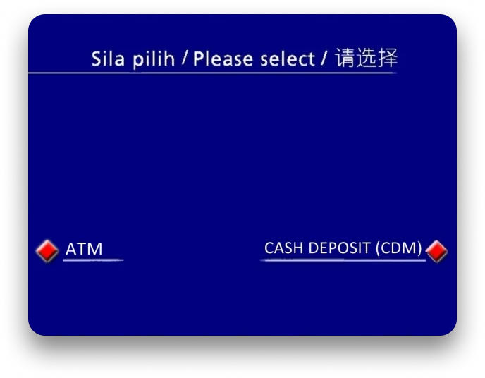
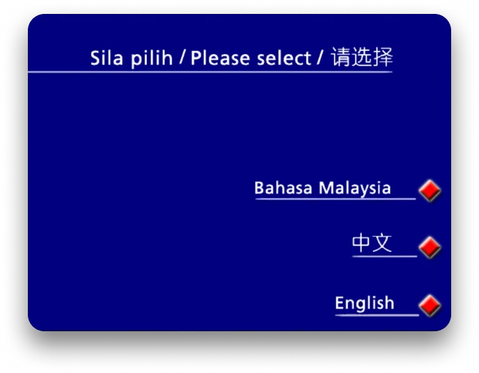
Using the China flag for Mandarin language selection may raise concerns of discrimination.
The interface appeals to Gen Y and Z, but older people may experience accessibility issues.
Windows icons boost performance and ease development but lack brand recognition.

Accessibility is Usability for All
accessibility
Prioritizing Accessibility
Accessibility was the top priority from stakeholder feedback, so I organized my priorities into four categories:
Colors
To use high-contrast colors that meet WCAG AAA guidelines while aligning with brand colors.
Touch Targets
To ensure touch targets are large enough to avoid accidental presses.
Typography
To implement a typescale that is easily readable for both younger and older individuals.
Guidance
To guide users on card insertion and when to use the physical numeric keypad.
accessibility
Assessible colors and touch targets
I iterated my designs by using high-contrast colors for AAA WCAG compliance and controls that are large enough for easy selection.
accessibility
Improving Readability for All Users
I applied a Perfect Fourth (1.333) scale to the SST interface, setting instructions to 48px and options to 36px to ensure legibility and an accessible hierarchy.
accessibility
Guiding through animations
I designed two Lottie animations for card insertion and keypad usage to provide clear, accessible visual cues for physical hardware interactions.

From Concepts to Reality
Final Result 🎉
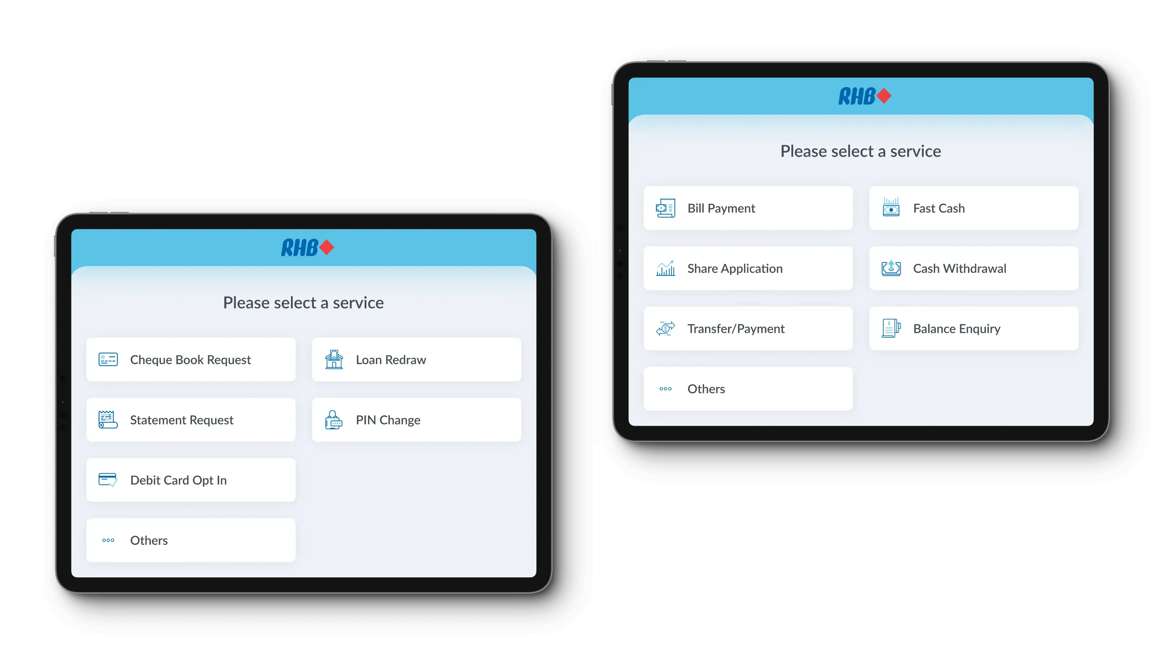
Reverted to Z-shaped service listing and preserved service order to support familiarity and muscle memory, such as placing balance enquiry at the bottom right on the first page of ATM services menu.
Eliminated country flag icons for language selection and crafted new icons for all services, ensuring alignment with RHB brand colors and guidelines.
Implemented larger touch targets, high-contrast backgrounds for readability, and consistent typography for accessibility and ease of use.
Modern Interface for A progressive bank
The new interface improves user experience with branded icons, animations, and accessible controls, transitioning from a two-decade-old design.
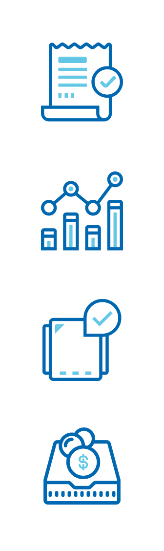
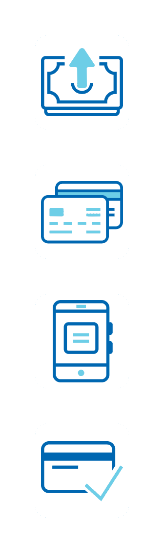
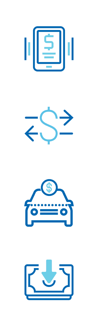
Icons That Reflect the Brand
Unique, branded icons for each service enable quick recognition, aligning with RHB's online and mobile banking style.


The Next Step: Action
implement
Gaining Stakeholder Consensus
After successful testing, I presented the prototypes to Retail Banking and Group Marketing for approval.
The Standout Feature
implement
Delivering Designs to Developers
I organized component properties and states into a specification document for seamless handoff.
More Details

Takeaways That Refined My Design Approach!
Delving into user behavior provided valuable insights, shaping the design to align seamlessly with their expectations.
Exploring kiosk machine software capabilities opened avenues for proposing innovative features, including animations that could enhance the overall user experience.
Collaborating closely with the Infra team was instrumental in testing prototypes and iterating for testing accessibility. All credits to the Infra team, and to the guidance of my ED team's Head and Section throughout the project.