
What's GOPAY?
GOPAY is a digital wallet application in Malaysia to settle utility bills, mobile reloads, renew coverage & road taxes, reload gaming credits, and numerous other services. Users receive a commission ranging from 1 to 10% for each transaction, instantly transferred to their digital wallet.
The Challenge
In the previous version, the app catered to users aged 30-45, resulting in a user interface and functionalities intentionally designed for simplicity, aligning with their cognitive abilities. GOPAY version 3, however, shifts its focus to a new demographic of users aged 18-30, known for their tech-savviness. Initial feedback from this demographic on GOPAY version 2 included:
The user interface is outdated.
The onboarding process is time-consuming.
Lacks sharing receipt feature when bills are paid on behalf of someone..
Frustrating to re-enter account details for bills that were already paid.
Inconvenient to remember the bill due date and use the app on time for payment.
The Crew

Dharmini, Product Manager

Shehryar, Product Designer

Niharika, Project Manager

Ibrahim, Back-end Engineer

Thiru, App Developer
My Role
I handled app design tasks, including:
Wireframing
Low-Fidelity Prototyping
Usability Assessments
User Journey Mapping
UX Copywriting
High-Fidelity Mockups & Prototypes
Handoff to developers
Additionally, I also designed and developed the GOPAY website on WordPress. However, this case study will focus on the UI/UX aspects of the mobile app.
Tools

App UI Design, pre-Figma days 🤪

Surveys

UX Presentations

Wireframes & Rapid Prototyping

Marketing Content

Website Design


Survey
We asked questions related to app experience, features, products and new enhancements to a total of 10,582 university students, current and former.

Pain Points
Following survey analysis, I organized an internal workshop with the business team to prioritize pain points based on user feedback and business viability. The top 5 user pain points identified during this session were:
Outdated UI
GOPAY version 2 UI does not appeal to the newly targeted group aged 18-30 years. They perceived it to be an outdated app and worried that the service would not be up to the market standards (Aesthetics - Usuabiltiy Effect)
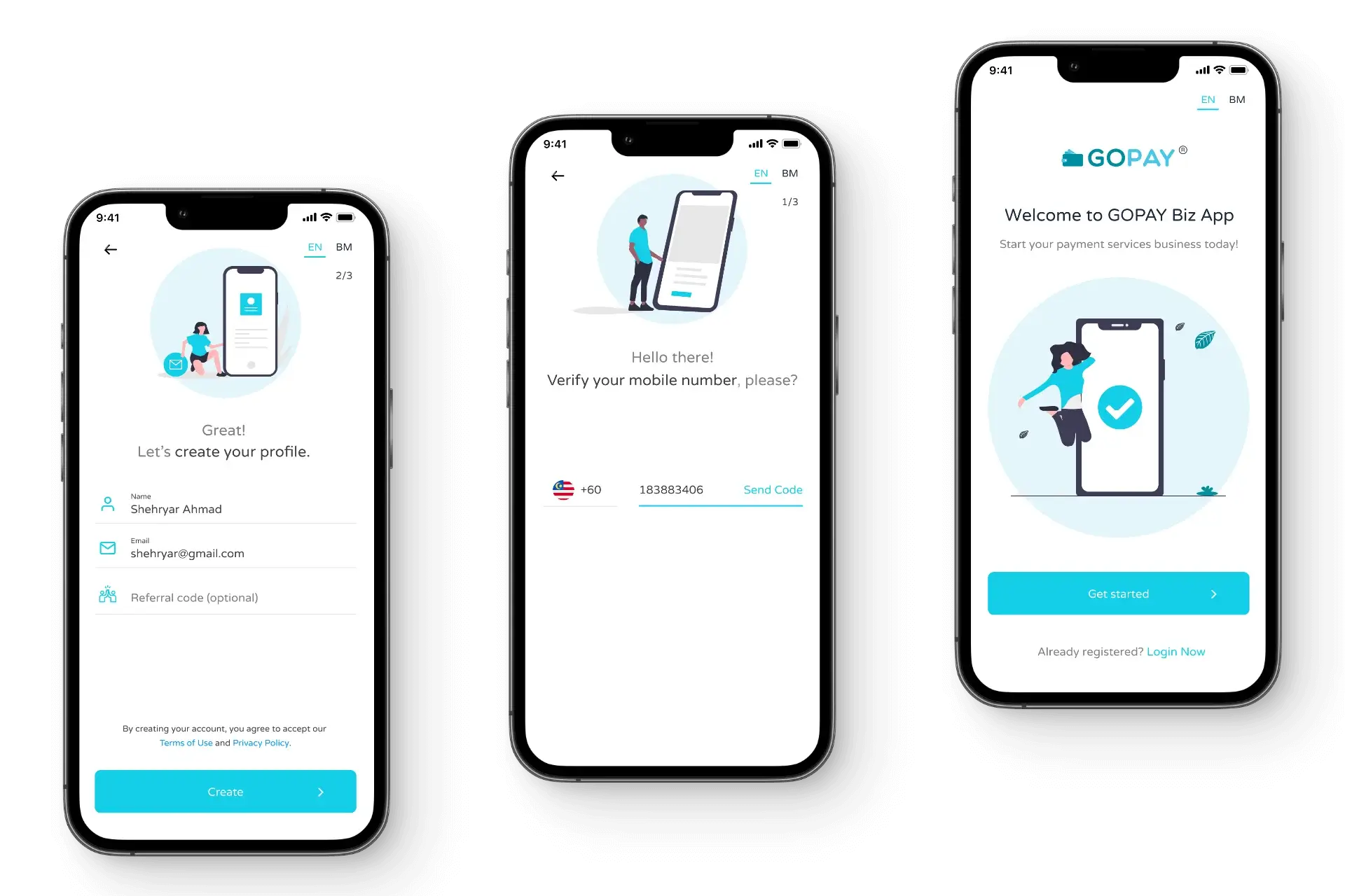
Lengthy Onboarding
The onboarding process requires email verification and collects unnecessary information, including house address, state, and city. Some users have reported not receiving the verification email, and in some cases, it ended up in the spam box without users being aware of it.
Cannot Track Commission
The transaction report offers limited information, including billing details and the amount paid, while the commission is automatically added to the user's wallet without any notification. Users are unaware of the specific commission earned on a product until they perform a transaction.
Cannot Save Billing Details
User need to re-enter account details when they want to pay the same bill again.
No Recurring Payment
Users find it difficult to set reminders manually and to make timely payments for fixed weekly and monthly bills.
Persona
Throughout design discussions, I consistently referred to the personas to validate design decisions and prioritise features. By visualising users' personalities, goals, behaviours, and frustrations through the personas, I could empathise with our users more deeply and approach the product from their perspective.

User Flow
I tested the new user flow for verification in usability testing to validate the change of process.

User Journey Mapping
During usability testing, I created User Journey Maps to capture the user experiences while interacting with the low-fidelity prototype. This exercise revealed opportunities for enhancing our app experience.
For instance, users expressed dissatisfaction with the current login and payment authorisation process, which required entering a PIN every time. Introducing a fingerprint scanner could offer users the flexibility to log in and authorise payments without the need to re-enter the PIN.
However, due to technical feasibility and compliance approval needed from the business team, this feature was moved to the backlog. The User Journey Map diagram for one of our participants is provided below.

Easy Onboarding
Replaced email verification with SMS OTP verification.
Removed unnecessary fields like username.
Replaced password with PIN that can be set after user creates the account.
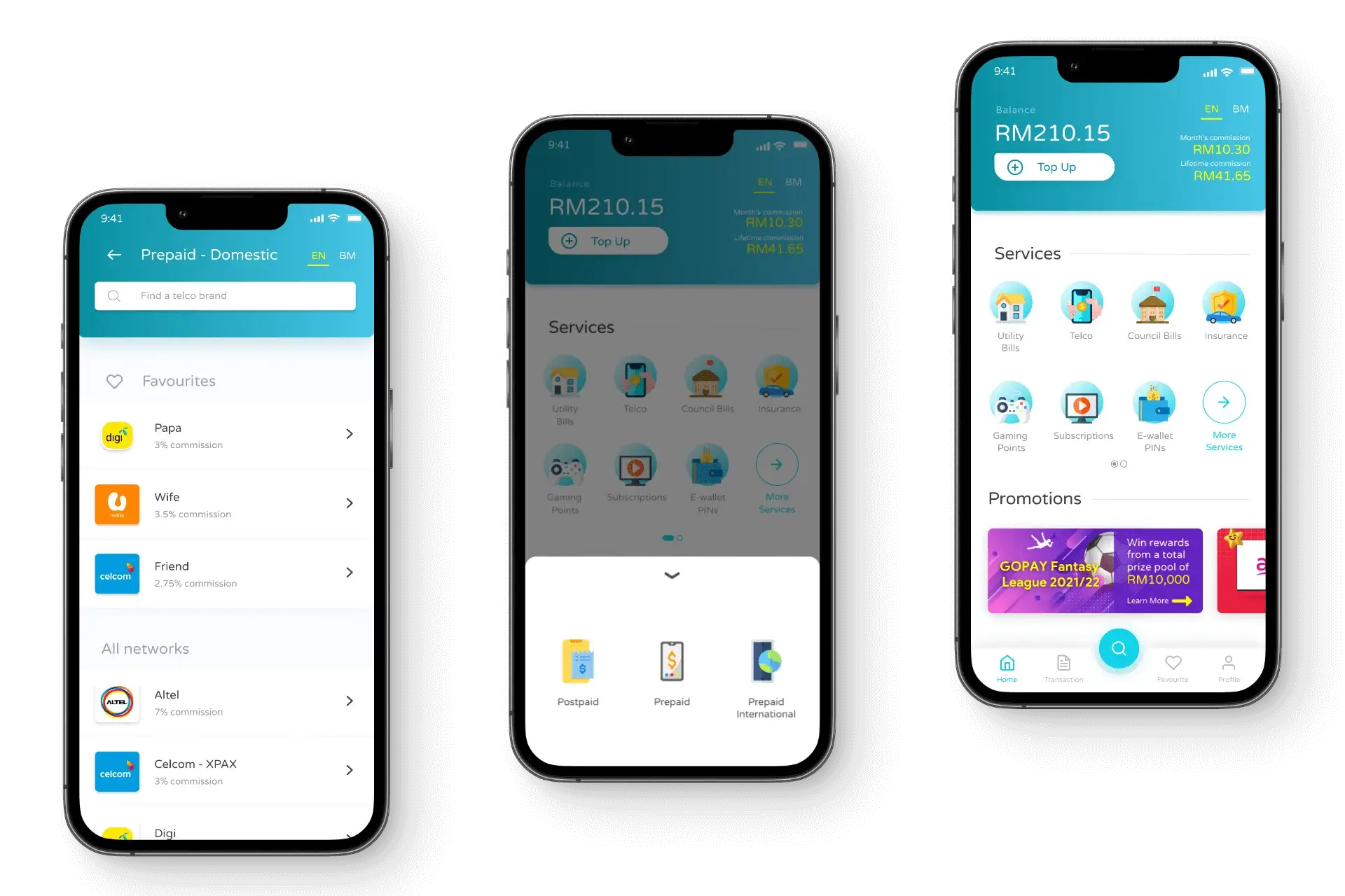
More interactive and usable interface.
Bottom navigation bar.
Master Search.
Display product logos.
Display product commission.
Track Commission
Commission tab in the Transaction page.
Product commission for each product.
Share Receipt
Share receipt via social sharing.
Included WhatsApp number field in the billing details to auto-send receipt to the customer.
Add to Favourites
Save billing details for future use.
Auto-Pay feature for recurring payment.
Set Recurring Payment
Monthly fixed payments.
Weekly fixed or flexible payment.


Before launch, the daily average of new users acquired was 56. Post-launch, this average increased to 121 new users per day. The majority of these users were acquired organically through word of mouth and social media, as the GOPAY Marketing team did not heavily invest in digital advertising at the time.
The table below illustrates the number of new users acquired in the last 180 days.

180%
Increase in returning users
Previously, the number of returning users were 30% of the new users acquired monthly.
With Add to Favourites feature and recurring payments, the returning users increased to 55% of the new users acquired monthly.
260%
Increase in registrations
Previously with lengthy onboarding and email verification, the install vs registration rate was 25% monthly on average.
With new onboarding and SMS OTP verification, the install vs registration rate increased to 65% monthly on average.
370%
Increase in revenue
Features like Add to Favourites and recurring payments resulted in a 370% increase in revenue. Also, displaying commission details in the product description enticed users to perform more transactions.
Working as the sole designer in the team, the challenge in this project was taking on a design leadership role early in my career.
I delved into case studies on applying design thinking and applied those principles with the given research budget. I also recognised the significance of using reusable components in the design, contributing to a simplified appearance as familiar actions used the same components.
Looking ahead, as we introduce new services, I aim to enhance the component library for scalability.